BlueCity Construction
Brand strategy, visual identity, logo design, website design, information architecture, content strategy, website writing, custom WordPress development, print design, signage, project management
From internal construction division to industry leader in sustainable, mass-timber development
A subsidiary of Century Group, Blue City Construction is a recognized leader in sustainable, mass-timber development. Formerly known as Century Group Construction, BlueCity had a new name but lacked its own identity. We worked with the BlueCity team to define their brand in words, visuals, and create a website with a focus on their strong portfolio of projects.
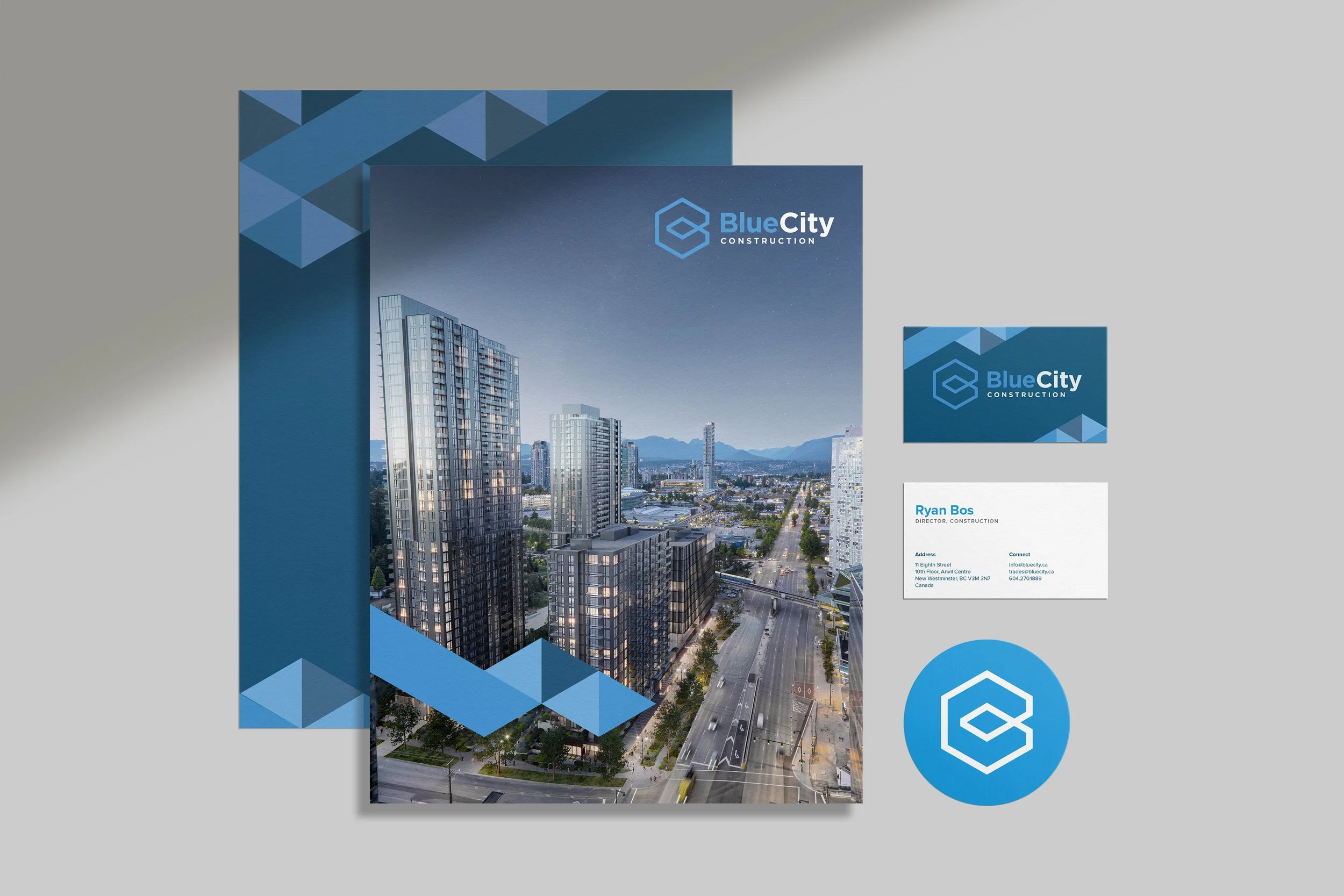
While the construction division of Century Group had been operating since 1957, BlueCity was a brand new entity with no pre-existing materials. We worked with Century Group to flesh out the brand, in both visual and written form, and deliver a logo, visual identity, and website that reflect their belief in sustainable practices and lasting value.

“Michelle consistently exceeds our design expectations. Her attention to detail, strategic and collaborative approach, and deep understanding of our business needs make working with her a pleasure.”
- Stacey Cheverie, Director, Corporate Marketing & Communications, Century

BlueCity Construction had a strong portfolio but nowhere to showcase all of their cutting-edge work. They wanted a website where their projects would be the focus. With an audience that includes architects, urban planners, and city officials, it was important that their website accommodate extra-large (2,560px wide) desktop screens. We worked with BlueCity to deliver a fast-loading website with big visuals and information architecture that prioritises exploring a portfolio of projects.


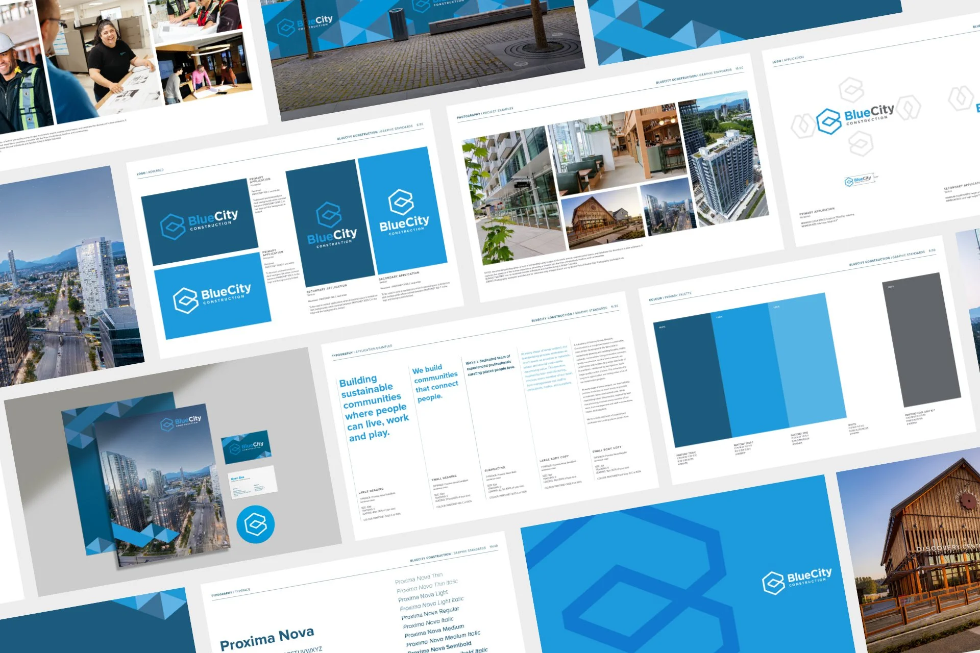
BlueCity’s visual identity is built on their mission to create innovative, sustainable projects and communities in which people can live, work and play. This vision is captured in the name—Blue (sustainable) City (community)—and echoed in the various elements.


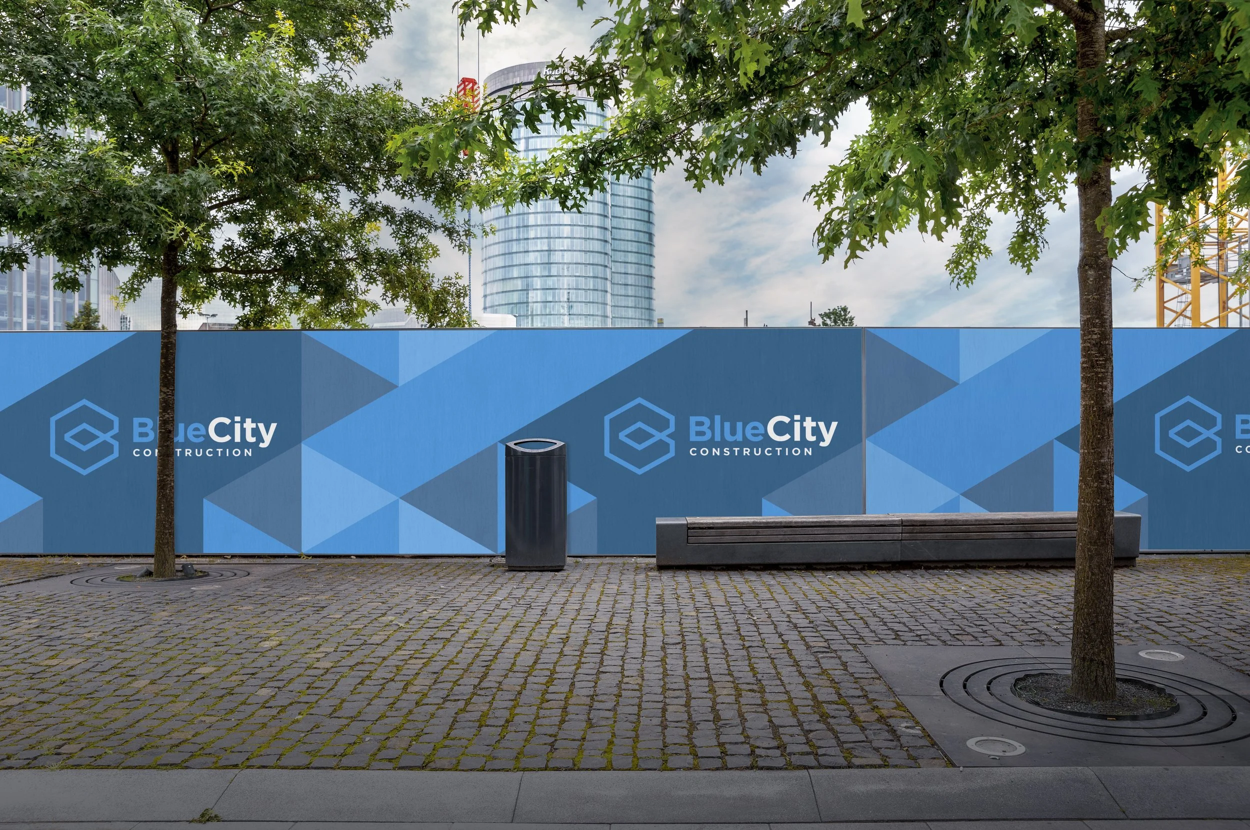
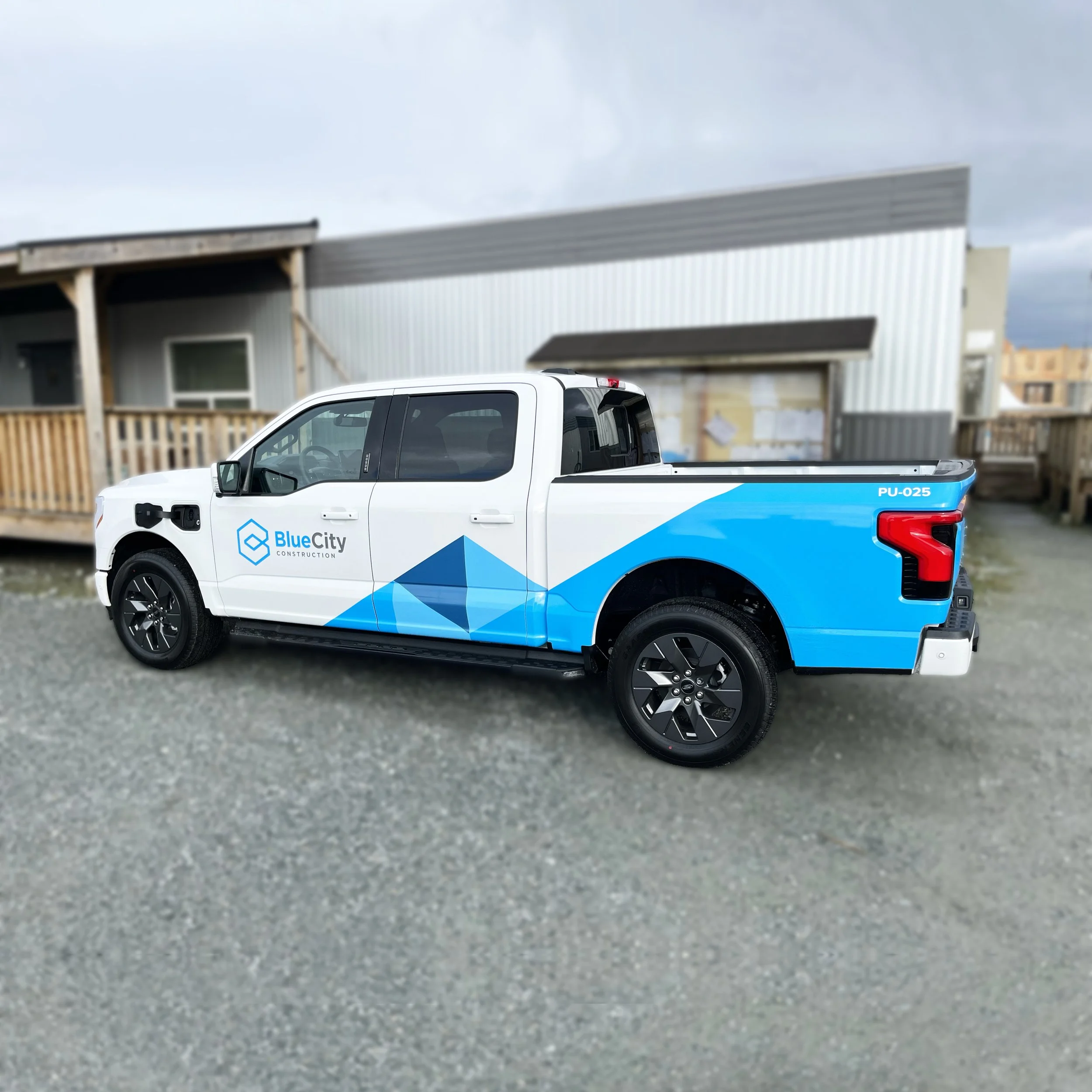
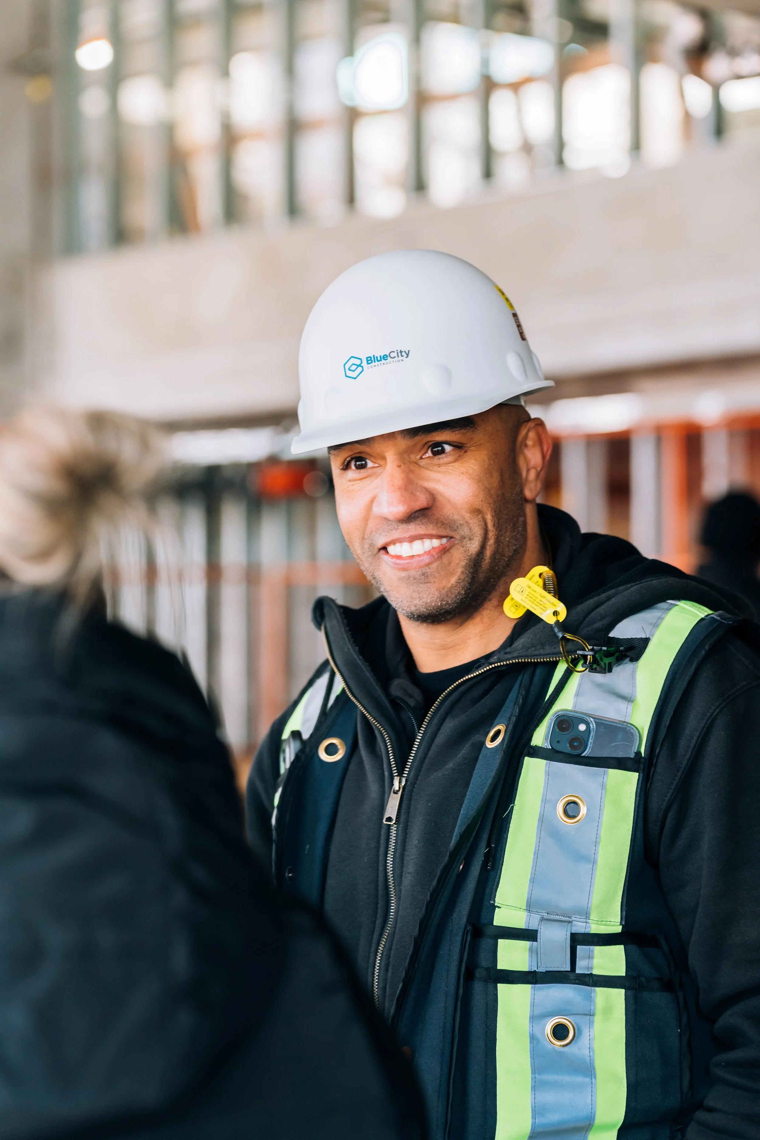
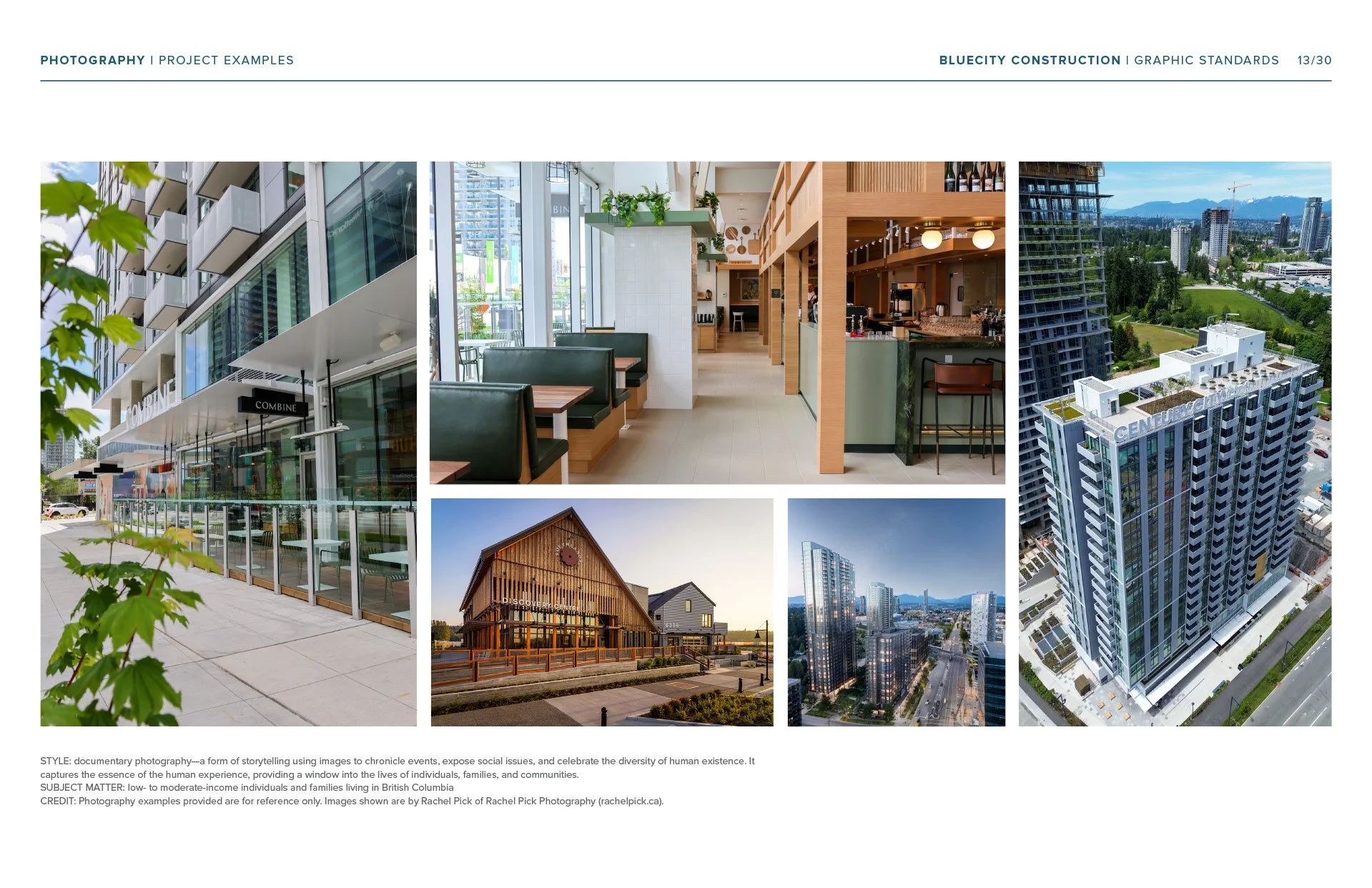
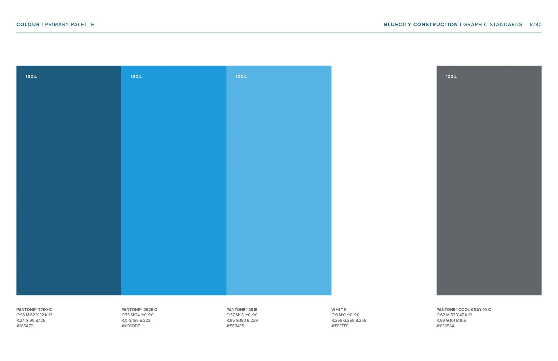
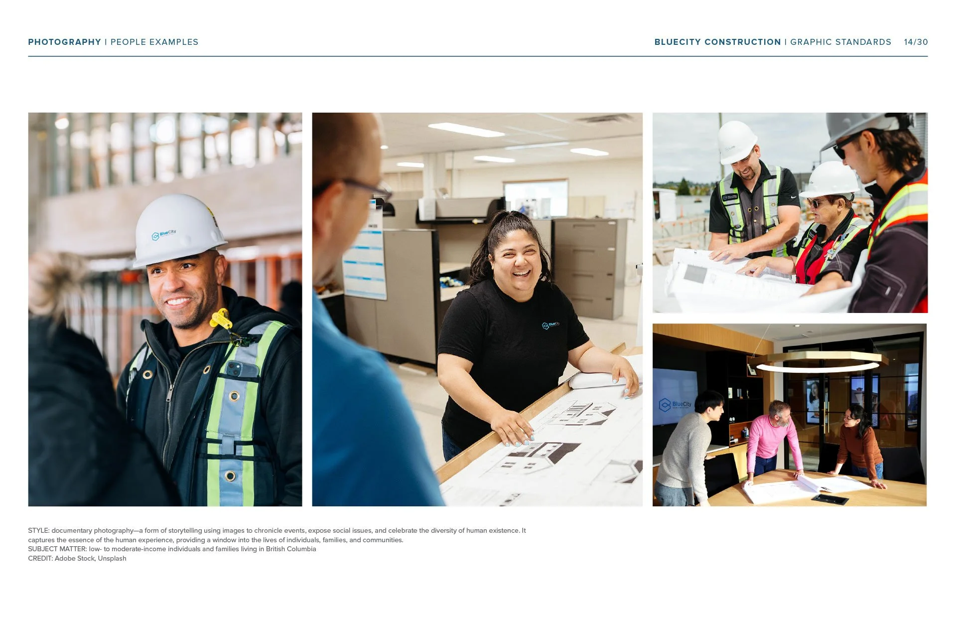
Geometric shapes are used to represent how the individual pieces (live, work, play) fit together to create a thriving community. A colour palette composed of various shades of blue play homage to the British Columbian landscape (mountians, water) and BlueCity’s commitment to sustainable practices. The beauty of BlueCity’s projects really speak for themselves so we made sure that photography was front and centre.
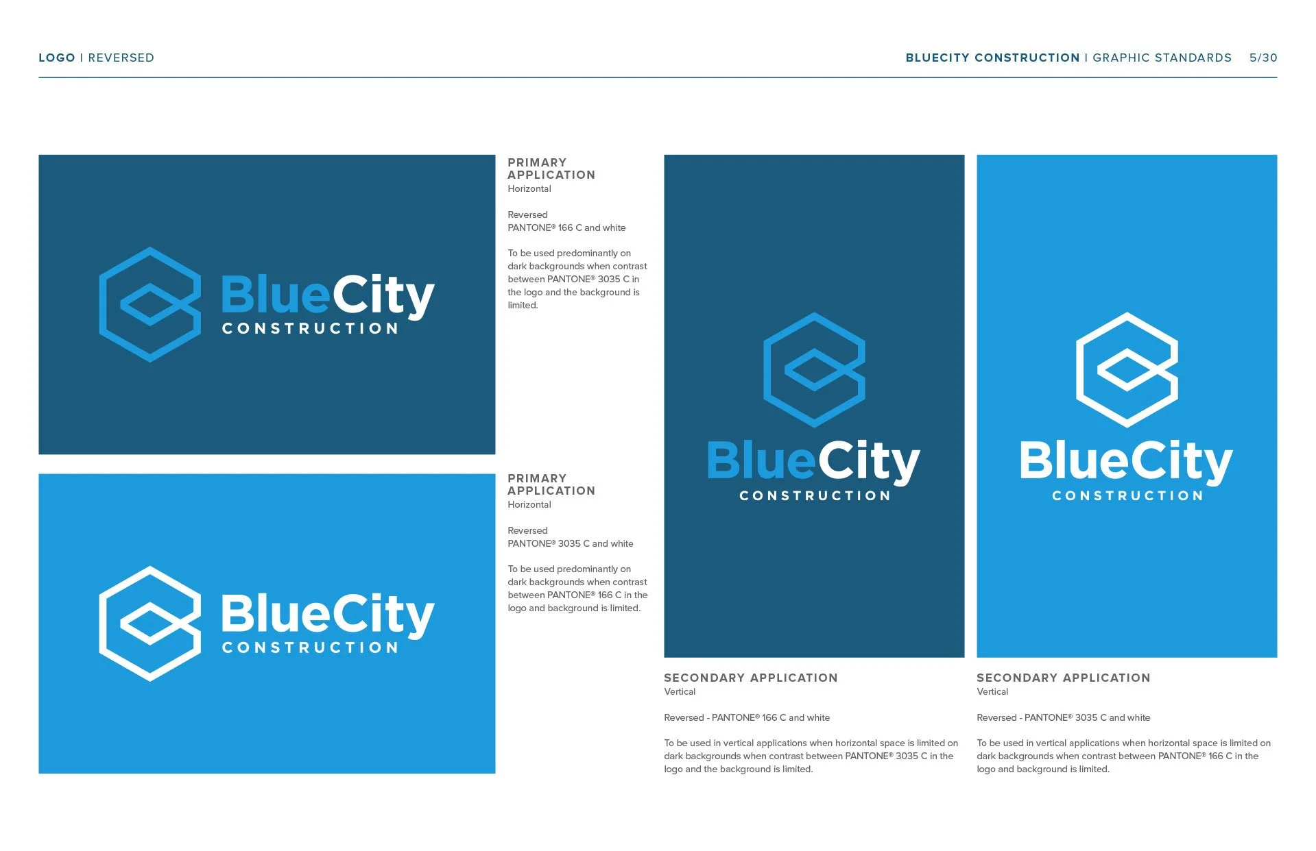
The geometric logo resembles a city building constructed of the letters “B” and “C” to represent BlueCity. Geometric shapes are used throughout their materials as a graphic element echoing BlueCity’s desire to create innovative, sustainable projects and communities in which people can live, work and play.
“Our recent collaboration was to bring our construction brand, BlueCity Construction, to life, a challenging project involving multiple stakeholders. Despite a tight deadline, Michelle managed all our design needs, including logo development, website design, and promotional and marketing materials. ”
- Stacey Cheverie, Director, Corporate Marketing & Communications, Century
Jeremy Lind of Viewpoint Digital, custom WordPress development
Wendy Lees of Wendy Lees Creative, brand strategy writing, website writing

