The Woods
Brand strategy, visual identity, logo design, illustration, print design, signage and environmental graphics, project management
The birth of an arts and wellness centre in the heart of the woods.

With a belief in everyone’s capacity to flourish, The Woods Arts & Wellness (The Woods) promotes the wellbeing of mind-body-spirit through engagement with nature and the arts. Taking a strengths-based approach, informed by the science-backed PERMA model of wellbeing, The Woods facilitates experiences of wonder, creativity, curiosity, and hope to foster a connection with the Sacred.

The Woods had a clear mission, vision, and purpose but struggled to find a way to effectively communicate who they are and what they do that was easily understood. With a unique combination of nature, art, and therapy, this one-of-a-kind organization felt like a category unto itself.
We worked alongside founder and Executive Director, Elise Girardin, MA, MCP-AT, RCC, to better articulate The Woods in both written and visual form.


While The Woods offers services in art, music, movement, and other creative expressions in a forest setting, the purpose of these experiences is to facilitate well-being. The services are tools to promote emotional and psychologiocal health—therapy.
Framing what The Woods offers as therapy provided a foundation to better describe their unique approach in a tangible way. This framework also directed the creative vision for the visuals which became less about the medium—art, music, dance—and more about the experience of the medium—calm, awed, empowered.


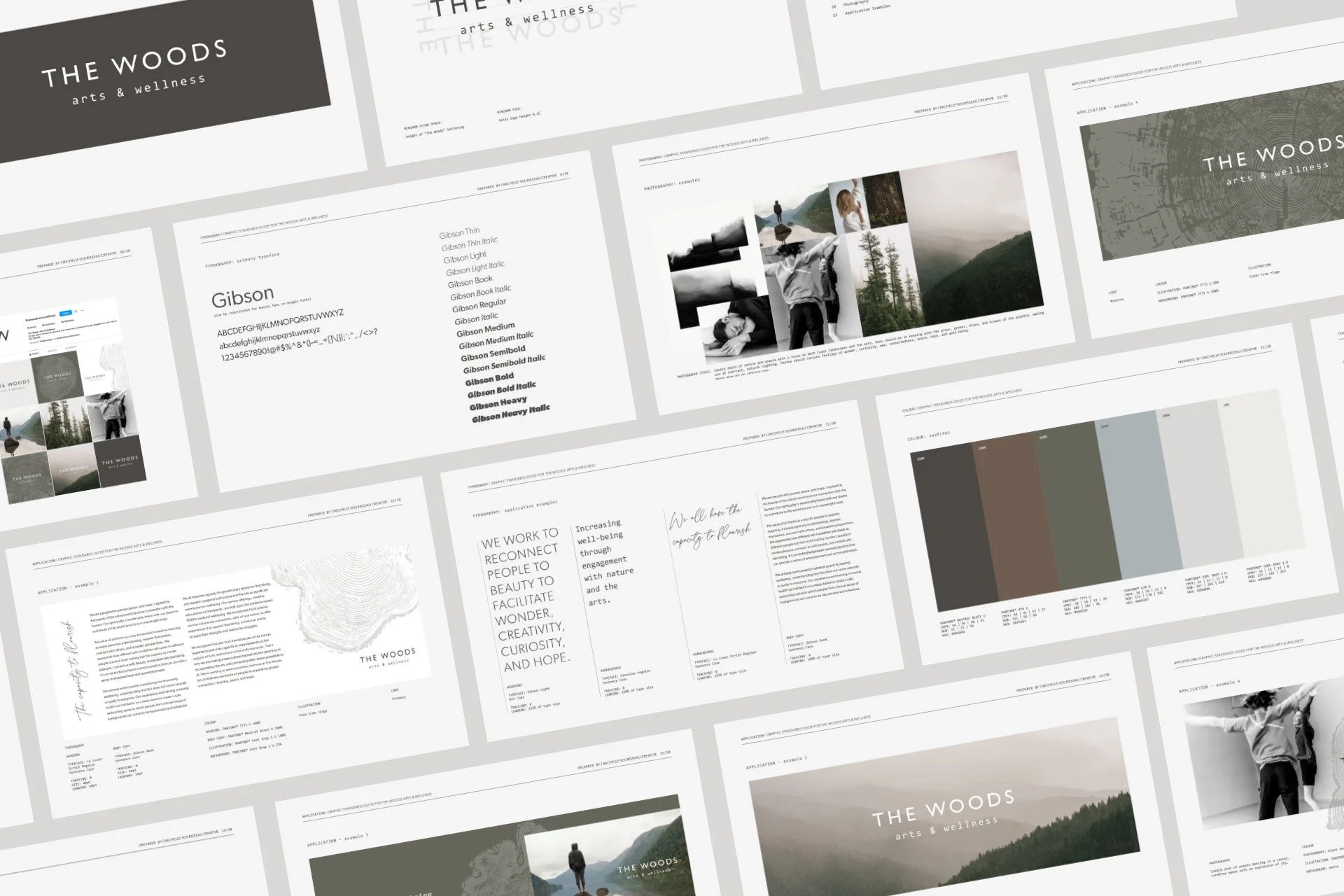
The Woods’s visual identity is centred around the concept of a tranquil sanctuary. This concept was used to influence all brand touch points including the logo, colour, typography, illustration, and photography.
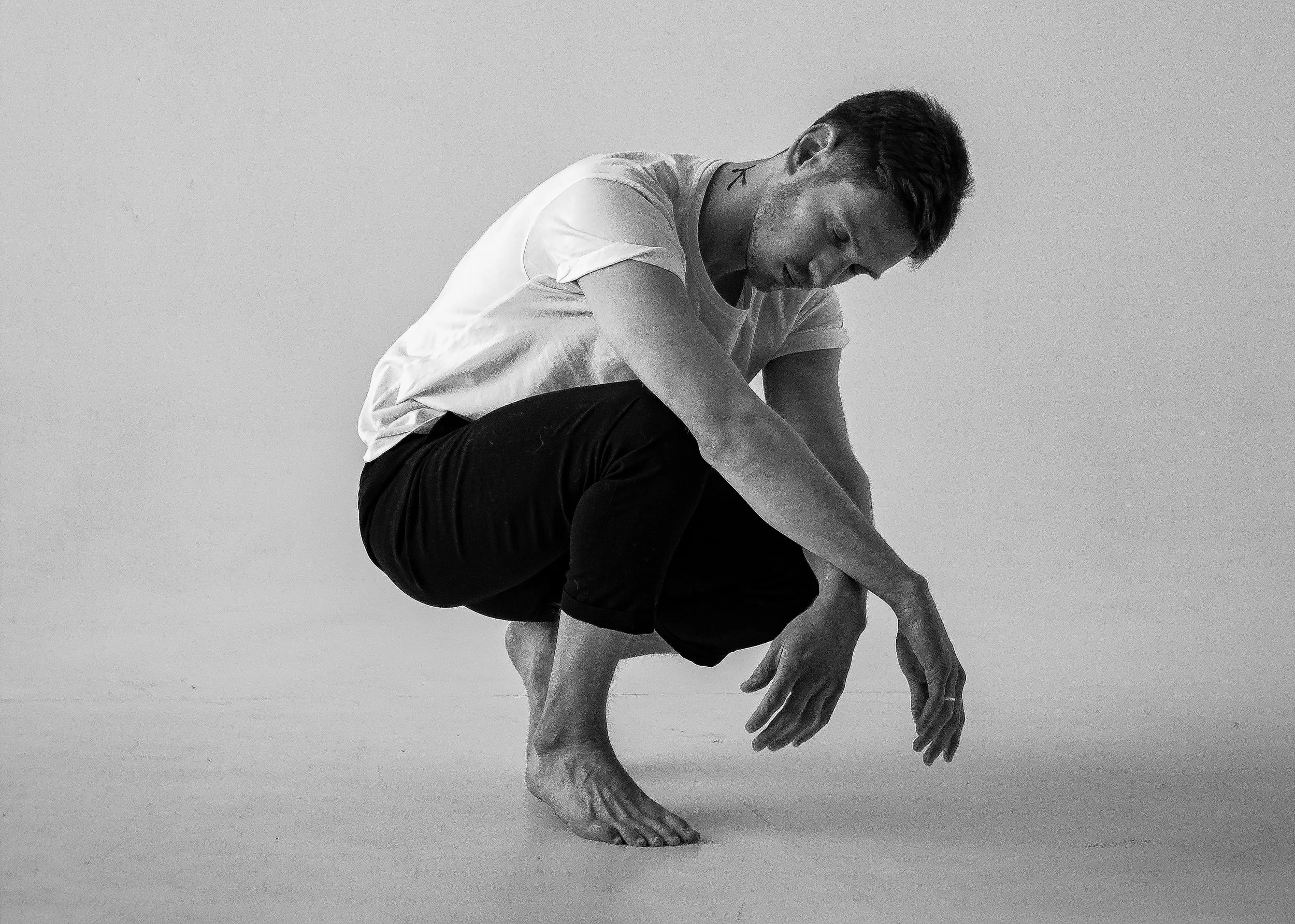
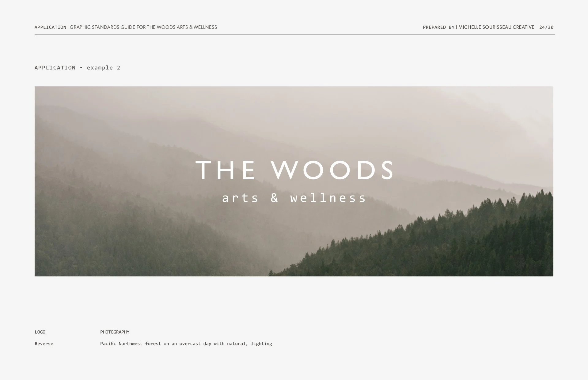
Candid images of people engaging in nature and the arts are used to conjure feelings of wonder, curiosity, awe, connectedness, peace, hope, and well-being. A focus on West Coast landscapes provides context for where The Woods resides in North Vancouver which is echoed in the muted palette of greys, greens, blues, and browns, making use of overcast, natural lighting.
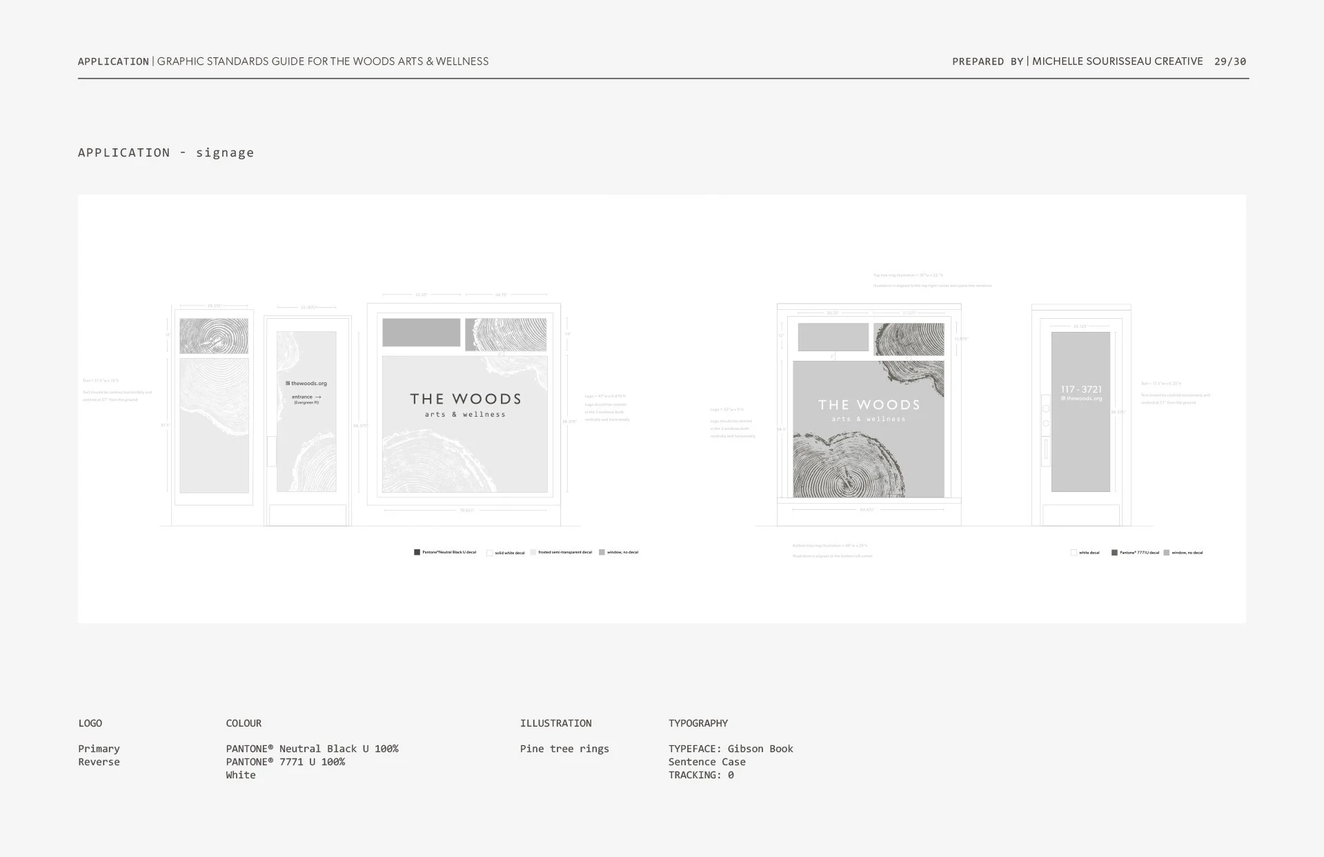
Illustrated prints of tree rings tie in both nature and the arts while offering a visual representation for personal growth. A collection of complimentary typefaces in sans serif, monospace, and script echo the eclectic nature of the various forms of art- and nature-based therapies The Woods offers.


We intentionally kept the logo typographic, leaving it open to interpretation, with the understanding that The Woods means different things to different people. The simplicity of the logotype also allows it to be used in combination with a variety of visuals.
The typeface for “The Woods” is clean and simple with generous spacing to convey a sense of space like the breathing room for your soul The Woods provides. “Arts & Wellness” is written in lowercase to give a feeling of unrefined playfulness and creative curiosity.
The tactile nature of print offered an opportunity to further express The Woods through touch. Smooth, soft, natural papers give a feeling of gentleness, calm, and comfort. Elements of embossed textures pique curiosity and intrigue, bringing up sensations of playfulness and exploration.


Wendy Lees of Wendy Lees Creative, brand strategy writing
Claudette Carracedo Photography, architectural photography
-
![]()
Dynamic Fenestration
-
![]()
BlueCity Construction
-
![]()
Closet Craft
-
![]()
BC Rent Bank
-
![]()
nidus3D
-
![]()
The Gatherig Church


